Project deadline
2 Months
Role
UX Strategy & Discovery / UI Design
Tools
Figma, Miro, Webflow
Repositioning for the next stage of growth
Dexory builds AI-powered robotics and software that give warehouse operators real-time visibility into their inventory. The business had grown quickly — strong product, serious funding, a growing client base of major global brands. The website hadn’t kept up.
The challenge
The existing site read like an early-stage company still finding its footing. Dexory needed a site that matched where the business actually was: capable of earning trust fast with enterprise buyers, and clear enough to communicate a complex technical proposition without losing non-technical stakeholders.
Understanding the warehouse decision-maker
We mapped the core decision-maker journeys across a two-stage buying process: initial discovery and shortlist evaluation. Dexory’s messaging needed to work at both ends — enough technical depth for the evaluator, enough business clarity for the approver. Stakeholder workshops and a content audit shaped the information hierarchy from the ground up.
Click on the image to zoom


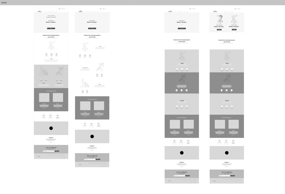
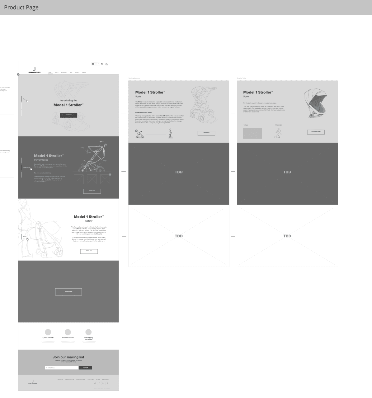
Architecture and user flows
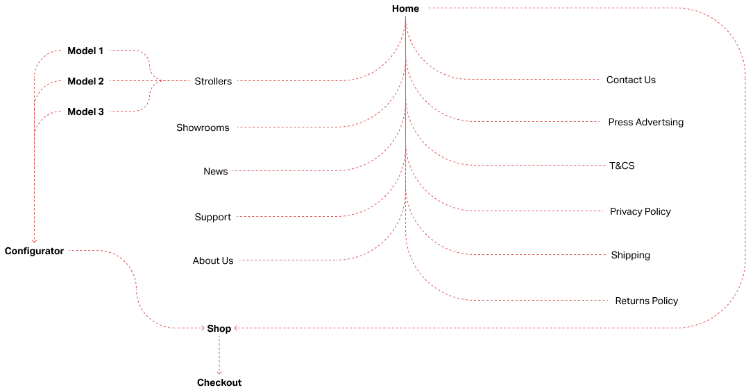
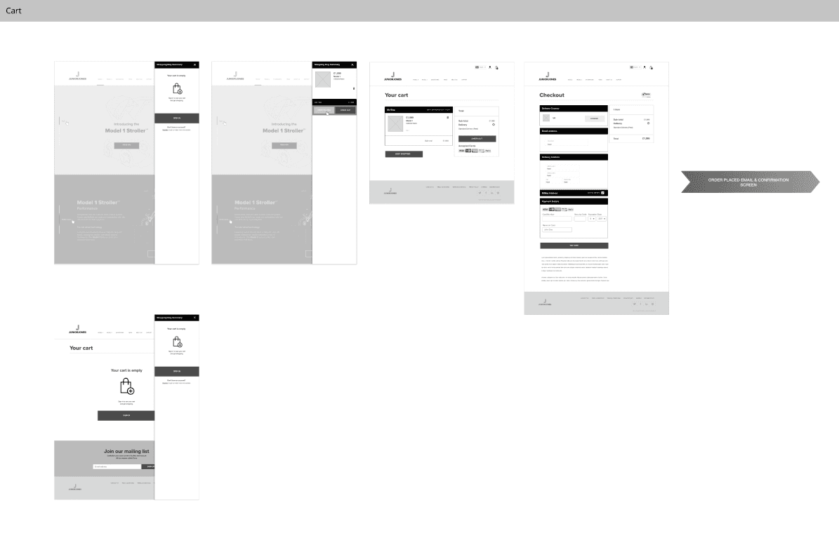
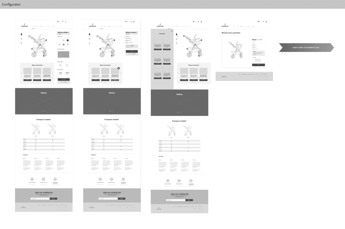
The site structure was rebuilt around two goals: earn trust on arrival, and give every visitor a clear path to the next step. A streamlined navigation created distinct routes for different audience types. Key conversion paths — demo request, case study, partner enquiry — were prioritised and mapped in Miro before any visual design began.
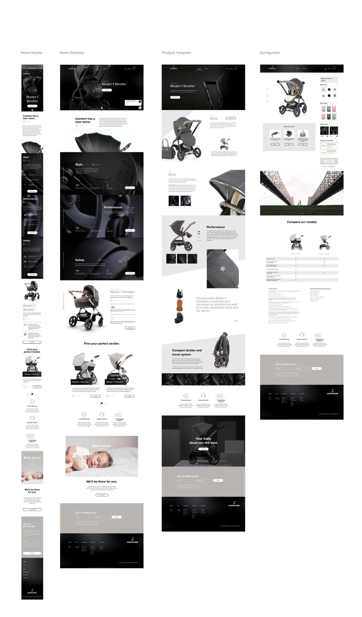
User interface design
The visual language took its cue from Dexory’s operational environment: dark, data-led, precise. A dark-first design system was built in Figma — token structure, responsive grid, a library of modular components. Copy and design developed in parallel to hold the hierarchy at every breakpoint. The finished file was handed off to the Webflow team with full annotation and a documented component guide.