Project deadline
1 year and 4 months
Role
UX Research, Usability Testing, Strategy and UI Design
Tools
Sketch, Dovetail, InVision, QuickTime
Intro
FindMyPast is a popular family tree builder company in the UK. It also works in partnership with the British Library scanning and making available an entire library of newspapers dating back from the 1700s, digitally and searchable text. It works as great source for researchers, journalists, academics, etc. The project is called The British Newspaper Archives.
Challenge
The British Newspaper Archives had a 23% annual churn from its main customer base: Students and researchers. They needed repeated access to the libraries and were happy to pay for subscription in the previous years before the new feedback interviews. A small team of five (two developers, one lead UX/UI, a Project Manager and a Business analyst were assigned to discover why such a high level of churn happened to our main customer base.
Assumptions based on secondary research
1. We began by collecting data and feedback from marketing. There was a significant amount of feedback (via our website wiki) about packages prices and the cost benefit of the subscription. The main assumptions we worked from were:
1. The majority of students felt that the annual package wasn’t relevant, since they didn’t need to use the website all year round. As a result users were buying the packages together and using a single account to save on package subscriptions.
2. Despite BNA offering searchable data from historic newspapers, the website didn’t offer tools for professionals to find, store and share data with their peers. In other words, after finding the articles needed, users had to endure a manual process of downloading the articles, organising, then sharing relevant data with their peers, causing a lot of loss of translation in the process.
3. Registration rate and free trial uptake was very low. Redesigning our Paywall and highlighting our Free trial value could improve registration resulting in better conversion rates.
Optimising conversion
We introduced a FREE TRIAL offer so users can try our offer before purchasing a plan. In this flow the user is presented with the PayPal later instead on the 1st interaction.
Click on the image to zoom


Solutions
By exploring BNA’s customer feedback, we’ve updated our UX Roadmap and began testing our assumptions using quantitative research to find ways to improve our registration uptakes and, eventually, quantitative data from our user interviews to improve our tools with the aim to improve retention.
A new low friction onboard journey
Enhanced on-boarding journey: ensure a more logical and less daunting journey for new users to the site, encouraging use of the free trial and reducing bounce rates
Pricing vs benefits
Upon improving our onboarding journey, our next challenge was to use the Marketing dept. feedback to understand our pricing value. We split tested alternatives by branching the website into three versions, we were able to understand which packages are more popular amongst our customer base.
Combining Behavioural and Attitudinal Research
On this next stage we listened to our customers. We began by observing our users using our professional and collaborative tools to complete a task. We followed up by a questionnaire and added data from Eye tracking heatmaps to understand users main pain points and where functionality needed to be improved.

Addressing customers main pain points: Searching, Collaboration and Inspiration
We identified researches and students had difficulties in finding “exactly what they need” due to the number of newspapers available. The search was often lengthy and they didn’t have an option to bookmark a page or a paragraph to be picked up later. so we redesign our search from scratch.

Addressing customers main pain points: Searching, Collaboration and Inspiration
Our collaborative tool nicknamed “My Research” allowed students and researchers to save their research from any point on a page, create folders and share with their peers so work could be streamlined between teams. The functionality has proven to be a success amongst our users with some opting to sign up for a full year instead of a 3 months package. We have eventually created an offer for teams bring prices down for a team of three or more people.


Addressing customers main pain points: Searching, Collaboration and Inspiration
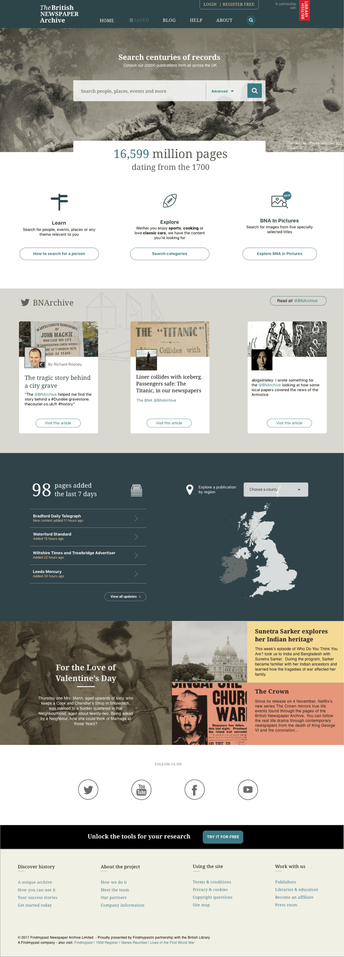
From our three user groups (professional researchers, students and “one offs”), inspiration was one of the major flaws on our website. Because precious content was buried under our search filters, customers couldn’t discover more about the trove of information available to them. This high value effort involved not one task but a complete redesign of our services and user interface. BNA hired historians to source interesting stories from our library of newspapers and the UX team was in changing of developing an engaging UI to surface this constant whenever possible. From Banners to e-mails to landing pages such as home, blog pages etc. At the core of our designs we added story telling to get users engaged. The results are below: